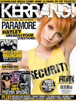
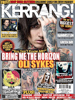
This is my front cover and contents page i made. I tried to appeal to my audience by using different techniques that kerrang, rocksound and nme use. I used the skyline, puffs and smaller images which all three of my magazines use, i also used a font (which i got from www.dafont.com) that was similar to the kerrang font. I used this font for my sell lines. I also downloaded another film which i used for the list of bands on the right hand side of my contents page, this font is similar used on the cover of rocksound.
My colour scheme was blue, purple, black and a reddy pink. I didn't want to use the typical red, black and white colour scheme. I used a variation of fonts just like a professional magazine would.
I tried to attract my audience through costumes by dressing my models in different clothes which would attract different stereotypes. For my front cover i had Kayla wear a black vest, light blue ripped jeans and a black and grey starry scarf.
 I got Kayla to post with one arm behind her head after seeing an issue of kerrang where Hayley Williams was modelled in a similar position. I chose this pose because i thought it would help attract my audience who buys Kerrang to come and buy my product as it looks like the sort of thing they would like.
 I also used the Kerrang Style font for my sell line. I had previously seen this issue of Kerrang with Oli Sykes on the cover, and in white lettering it had 'BRING ME THE HORIZON' then in yellow letters it had 'OLI SYKES'. I tried to replicate this by using the words 'I'M BACK' then putting 'KAYLA WARD' in larger lettering. All of the writing was written in black but the smaller text outlined in purple and the larger text outlined in red/pink. I did it like this rather than completely copy the kerrang cover and the text is still different.
Contents
For my contents page i very much styled it like a rocksound contents, a simple list of pages and what was on each of them. I used three images on my contents page. I used one of my model Lauren, who also was on a smaller image on my front cover, a close up of my model Kayla who was on the cover too, and finally a shot of the singer from The King Blues, that i took myself over a year ago at a concert, i used this images as a live poster, which is the kind of thing that music magazines do. I also divided my contents page into six different sections; news, live reviews, features, gig guides, albums and extras! I did this to appeal to my audience, as when i read magazines and i am looking for something in particular for example an album review, i would be able to look in the contents and find whereabouts to go.

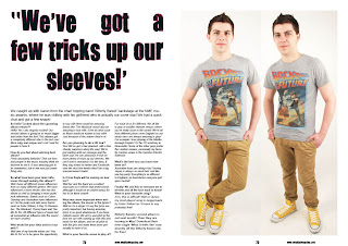
This is my double page spread for my product, i tried to lay it out more like an NME dps. I tried to keep it pretty simplistic, yet effective. I took two different pictures of my model aaron and altered the lighting and cropped the pictures so they look roughly at the same height. I added a smaller caption in the bottom right hand corner saying ' .. double trouble?' I did this to give of the effect that there was two people, and that there would be twice as much trouble.
 I used this double page spread , from NME of Lily Allen. I tried to use a similar effect with my sell line on the left page, a quote taken out the text. For the other page i didn't use the images in the same as this, but tried to keep it pretty simple like this is.
 Feedback Videos.
Here are some feedback videos i received about my products.
From these feedback videos i received from my peers i have learnt what they thought about my magazine and what it looks like from another persons perspective. They all stated whether they could tell what genre it was and most of them got the gist that it was a rock magazine. They also said what caught their eyes when first looking at my product, and why it stands out. They also gave me strengths and weaknesses which gives me the opportunity to improve my product knowing what they audience wants. They stated whether or not they would buy and why they would or wouldn't. I feel this feedback i received from my peers is very important and the constructive criticism and praises i received for my products helped me learn about my own product from the audiences viewpoint.

No comments:
Post a Comment