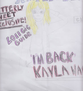
These are my flat plans for my front cover, contentspage and double page spread.
I am going to call me magazine 'Amplified' i think this relates to the music genre of magazine as generally people like their music loud so they would technically 'amplify' their music.
I am going to do my masthead in deep purple, and use blues and greens. I think i will use white for the background, so the purple, greens and blues will stand out and grab the readers attention, sort of in the same style as NME but steering away from the stereotypical 'red, white and black' colours.
For my masthead i am going to use dark purple on a black background and to outline the letters in dark pink. For my front cover i am going to use a female model and i have taken the idea from the issue of Kerrang i analysed by having a sell line then the name of the artist in bigger letters on top of my model.
For my contents page i am going to use the same colour schemes as the front cover cover. I am going to use a two column contents page. and for each story thats one the front cover i am going to put a star next to them saying 'cover story' another idea taken from kerrang.
For my double page spread i am going to use to large half page images on the right hand page. For the top image i am going to make it look as though my model, Aaron is either jumping or having a good time to music. While the bottom image him crouching down as though its noisy, trying to give the effect of the top image being an upstairs and the bottom image being down stairs. On the left hand page i am going to have either four small images on the top of the page or two smaller ones. I am going to do a two column article on the bottom of the page.


No comments:
Post a Comment