Monday, 31 January 2011

Organizing Models

I am using  range of different models for my music magazine all ranging in the age group 16-24.

I am going to use my cousin, Aaron and his friend Kayla who are both in their early twenties which demonstrates different age groups.
I will also use some of my friends around the age group of 16/17.

I will be able to take some of the photos within college time with people who have the same frees as me.
With Aaron and Kayla they both work at the same place but get certain days off so i will be able to take the photos then.

I will be taking the photos of Aaron and Kayla on Tuesday 8th Febuary 2011.

We will be taking photos in the Studio, using props such as geek glasses, guitars, amps, etc. 
I will also be taking photos on the front of the arts centre and in stanhope park.
For the make up on Kayla i was thinking of using bright red lipstick as it catches the eye of the reader, as red is a signifier of things it may make people want to stop and buy the magazine.
For her Hair it wil be straight and i will take photos of her hair and make-up before i start shooting the cover.
For Aarons hair i am going to spike it up a little but just try and make it simplistic.

 
For the smaller pictures in my magazines and for the pictures on my contents page i will be using my 16/17 year old friends to demonstrate a different age group and different kinds of styles. For these as they are only going to be smaller images i am going to use the studio, with the models in there own clothes as some of my friends fit the stereotype of what i am looking for. 
For one of the models i will use a friend thats got piercings to show a more alternative stereotype. Another idea for a model i have had is my friend skating on a skateboard and taking a photo of that to develop a skater stereotype. 

Costume & Props

For the costumes i am going to dress them a cross between the indie and alternative stereotype Indie, wearing jeans, t-shirts/band t-shirts, plimsolls/converse/scruffy boots. For the male model.

For the female model i was thinking floral dress with tights and plimsolls, or jeans/top/boots or something.
With quite simple make up and i will take photos to show the process of doing the make up and costume.

By dressing them in band shirts and converse i think it will attract the audience as it is similar sort of styles as NME, Rocksound and Kerrang. I'm trying to make it more of a cross genre than just basing it on the one magazine.  I will dress my models within the age range of 16-24 so they are dressed for the right age group and are posed like the right age group.

For my male model about the age of 22 i am going to dress in a Rolling Stones, grey or black skinny jeans and white plimsolls i think, or perhaps a plain grey t shirt with  a black and white scarf to accessorize.


grey/black carrot style skinny jeans.


for my female model a vintage rock style t shirt and skinny jeans with baseball boots/scruffy boots/plimsolls.

Pitch Reflection

In the class we presented our idea's to our teacher and the rest of the class and recieved feedback and notes on post-it notes. My feedback consisted of;

It was an ambitious idea but i need to do practice shots. I need to make more definate decisions, and decide which props and costume i'm going to use.

What is the article about?
The article will be about two different artists coming together for an interview and one concert.

i need more planning but i have a good idea for my DPS.
I know what i'm doing and i'm organised i just need to put it into practice.

Need to produce good flat plans.
Good audience research.
How am i going to make the magazine flow?
More idea's needed.

Do research into colour pallette.

'Good ideas, what about sell lines'

Whats your magazines name? - i have chosen to call it Amplified.

How many selllines on the cover? - About 3/4

Think about poses.

Flat Plans

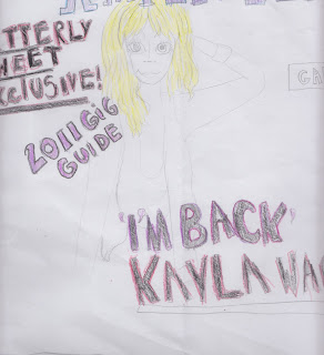
These are my flat plans for my front cover, contentspage and double page spread.

I am going to call me magazine 'Amplified' i think this relates to the music genre of magazine as generally people like their music loud so they would technically 'amplify' their music.

I am going to do my masthead in deep purple, and use blues and greens. I think i will use white for the background, so the purple, greens and blues will stand out and grab the readers attention, sort of in the same style as NME but steering away from the stereotypical 'red, white and black' colours. 


For my masthead i am going to use dark purple on a black background and to outline the letters in dark pink. For my front cover i am going to use a female model and i have taken the idea from the issue of Kerrang i analysed by having a sell line then the name of the artist in bigger letters on top of my model. 


For my contents page i am going to use the same colour schemes as the front cover cover. I am going to use a two column contents page. and for each story thats one the front cover i am going to put a star next to them saying 'cover story' another idea taken from  kerrang.
For my double page spread i am going to use to large half page images on the right hand page. For the top image i am going to make it look as though my model, Aaron is either jumping or having a good time to music. While the bottom image him crouching down as though its noisy, trying to give the effect of the top image being an upstairs and the bottom image being down stairs. On the left hand page i am going to have either four small images on the top of the page or two smaller ones. I am going to do a two column article on the bottom of the page. 


Tuesday, 25 January 2011

Focus Group

For my focus group i made a questionnaire of ten questions and got five different people to fill them out so it would help me decide how to make my magazine look professional and so it looks like it is aimed at the right audience. 

I asked them the following questions; 

  • How old are you?
  • Are you male or female?
  • What catches your eye when looking at a magazine?
  • Which colours do you prefer?
  • What kind of images do you like?
  •  Do you read NME, Rocksound or Kerrang? If yes please states
  • which.
  • If you saw a magazine advertising a free magazine or poster would it give you the incentive to buy it?
  • What features do you like? E.g. interviews, gig guides.
  •  What genre of music do you like?
  •  How much would you want to pay for a magazine?
These are the questionnaires i received 


The people i asked ranged from 16-21 year olds from both male and females. 
They said that bright colours, interesting looking articles, front cover images, mastheads, main cover stars  and advertisements catch their eyes when looking at a magazine. I found the colours they prefer were black,red,purple,blue,pink, yellow. Everyone i asked read NME, Rocksound or Kerrang. They all said they would probably buy a magazine if it advertised a magazine or a poster of an artist they liked and that it is a good sale pitch to add to my magazine. They were interested in features like interviews and gig guides. The genres of music ranged from mainstream, rock, punk, ska, dubstep, metal and drum and bass. 
They also said they would pay between £2 - £3 for a magazine. 

Photography Test Shoots.


I took this photo of Ryan and Cornelia jumping off the wall to try and show the fun sides of things. I like this photo purely because of the content but the composition isn't great as there is a large amount of space at the top of the picture and Ryan is positioned really low down on the right hand side of the shot and Cornelia is on the left hand side really quite high up. There is more than enough room for a masthead and things like that but putting sell lines and smaller pictures on many be a problem.


Out of all my photos this is probably my favourite because i like the composition of it. I think that this particular would be ideal for a half page image on the DPS. It was taken in the studio so the lighting is good. I think it looks fun and natural and when i take the proper photos for my magazine i will try and replicate this.


I took this photo in the studio and i think it would be ideal for a DPS. I had Cornelia stand on the ladders so it looks like she's talking down to Emma, giving the impression Cornelia is talller.

I took this shot of Emma sat on a tree stump outside in the park. The lighting is pretty good, as it the composition, there is enough room for a masthead and a skyline about her head, aqnd enough room for selllines and smaller pictures around her. A shot like this would be ideal for a front cover shot.

Monday, 24 January 2011

Photography Research


Lily Allen

I like this picture of Lily Allen as i like the composition of the picture as well. I like how she is dressed in this as it reflects the kind if music she makes and her personality. The background is two different shades of pink light at the top of the shot and dark at the bottom. It is a medium shot, and her eyeline is lower than the top third, which suggests a sense of innocence, pretty that she is the girl next door type. Her hair in the shot is tied up in a messy ponytail with a small bow which again suggests a sense of innocence, and also makes it look a bit cheeky and fun. Her dress is dark, but still fun, with yellow and purple on again suggesting innocence, making her look fun and bubbly. Her body language is still quite open even though she is stood with her arms crossed which suggests she is friendly and approachable, this kind of photo is the kind you would see on a front cover. I think this would be quite easy to replicate but if i was to do so i would have to get it just right, otherwise it wouldn't come off right and the correct message wouldn't be put across quite right.


Enter Shikari
This is a medium long shot of the rock band Enter Shikari, they are all positioned at different planes within the shot but noone is given really a sense of dominance. They are all stood in different poses, all quite fun and cheery suggesting that they are a fun, childlike band, just having a good time. There all pulling silly, fun, childish faces which suggests a sense of innocence, fun and games, as though they are just having fun being in a band together. They are all dressed kind of similar but still different, for example, they are all wearing hooded tops, jeans and trainers, but still all look different. None of them have a particular high eyeline, as they are all posing and noone is made to have more dominance within the photo. I like this photo as i like the lighting, because its desaturated with a hint of sepia tones, and i like the composition. This image is ideal for a double page spread.


Arctic Monkeys
This is a medium long shot of indie band the Arctic Monkeys. It is ideal for a front cover/double page spread, with the shot type and eyeline placed in the top third. All band members are stood at different planes within the shot, and each members are all dressed differently. The shot has been taken in black and white or edited to be black and white, which gives it a more classical look about it, the three band members situated further back in the shot are all wearing darker clothing and don't appear to be looking directly towards the camera. Alex Turner, the frontman of the band, is dressed in light grey clothes separating him from the band, he is also looking directly towards the camera, and there is a use of a slight low angled shot and ever so slight a shallow depth of field, to single him out so people know that he is the main man. I like this picture of the Arctic Monkeys, just because it looks classy, and so simple, and i would love to be able to replicate it, i think it could be possible to replicate it on some levels with my own models.


The Blackout.

This is a medium long shot, of the band 'The Blackout' it would be ideal for a double page spread, and people are at different stands within the shot. The first thing you are drawn too within this photo is the writing on one of the band members shirt, which says 'We Are The Children Of The Night' this suggests that they are youthful, like to have fun and are here to stand out. Unlike the others, they aren't all dressed similar, they are dressed in different types of clothes, with different hair styles, and two of the band members are pushed right to the back of the shot, this suggests they arent as important within the band as the other members are. What i do like about this shot though is the lighting, i like how its high key lighting, are just how it looks basically, i think it would be harder to replicate than the others, just because in this there is a lot of people in a small amount of space, and i think it would be harder for me to pull off and it still look good.

Audience Research


For the stereotypes i have found some videos from findyourtribe.com to demonstrate the stereotypes that my magazine will be aimed towards.


Indie Kid's


indie scenesters. 


Monday, 17 January 2011

Textual Research

my idea.

my idea is to create a music magazine based around two different genres - rock and indie.
i have chose these genres as it is something i am enthusiastic about and take interest in.
i have chose to use magazines; NME, Rocksound and Kerrang as my analysis.