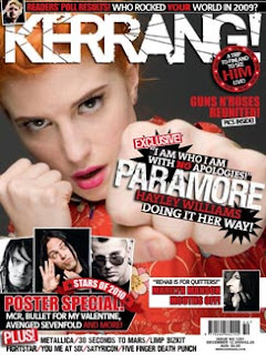
I used this for my front cover shot i cropped out the rip in the background and lightened it slightly. The models clothes were her own and as she is a hairdresser i asked her to come with her hair in the style she thought would look good and i think i achieved a good look for my front cover.
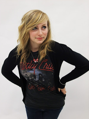
I used this of picture of my friend lauren for a smaller image on the front cover as a poster. in photo shop i lightened it and change the contrast. The model came in her own clothes and i didn't add any make up or change her hair. She wore a motlley crue t-shirt, blue skinny jeans and a black cardigan and it was accessorised with studded bracelets which i think adds a bit more punky feel to it.
i used this picture of my model Aaron for another smaller image on the front cover - as a poster star. In photoshop i made it darker and used different effects to make it look like this.
I used this close up shot of my model Kayla for a smaller image on the contents page. I didn't have to crop it or anything on photoshop as this was the exact picture i shot in the studio.
This is a smaller image i used for the contents page, i took it at a concert i went to over a year ago and kept the images. I used it as it looked authentic and as though it looked like it belonged in a music magazine. I was allowed to use this image as i had taken it myself and not taken it from the internet, i thought using a picture of a live shot would add authenticity.
this is another live shot i took at a concert. As i tried to base my magazine around Kerrang, NME and Rocksound i thought it would make it look more realistic. I took this photo a while ago and found it on my home computer and thought it would add a more realistic feel to my magazine.
This is a picture of my model Aaron which i may possibly use on my contents page. I like the composition of the shot and the pose. I also like how his t-shirt becomes a main mart of the image too.
This is one of the images i used for my double page spread. I like this image because his outfit and pose are very apparent and i think it adds a more personal feel to it. The models clothes were his own and the converse boots were mine which i lent him. I didn't add any make up or change his hair and i'm happy with how this turned out.
 This is the other image i used on my double page spread. I love how the yellow baseball boots catch the readers attention. I have lightened this image slightly on photoshop just so it looks more open and friendly as it looked a bit too dark before hand and the quality didn't look as good.
This is another image of my model Lauren again i changed the brightness on photoshop.


